 pagespics
B+W vs Color (Again)
Photographing India
India is heading into the summer, and it is getting seriously hot. This weekend I headed out at 3.30pm and was roasted alive. The summer months are going to force my shooting to the early mornings and late afternoons, which is possibly a good thing as the light is excellent at these times of the day. On another note, my youtube channel is taking off with eight subscribers! Maybe the midday can be used to work on my vlogging skills – they need it! Here is the link my channel, which is in its very early days.
https://youtube.com/channel/UCX8f_HNdZ7zyl9qQK1Z7p7w?view_as=subscriber
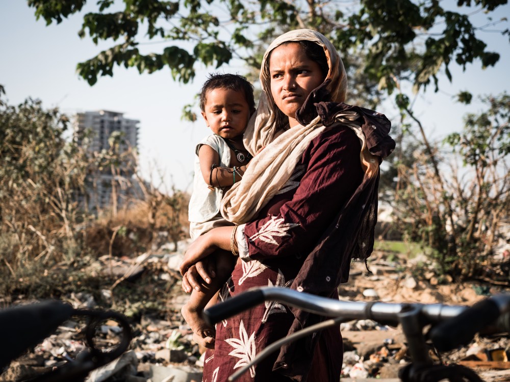
Mother and Child
Location Location Location
“If you want to be a better photographer, stand in front of more interesting stuff”
Jim Richardson.
The above quote encapsulates my latest photography location, which was found quite by accident. As you may be aware, I am fond of taking my camera to explore squats, slums, and dereliction. A slum provides a window to the world, and this was particularly evident at this location, which is a small city dedicated to the recycling of trash. As is so often the case, the people there express greater joy than many privileged individuals I know.
Street Photography can be as much about people skills as technical no-how, and I learned something new on my latest shoot. Indian women are incredibly colorful and can be very photogenic. However, at this location, they did not want to be photographed. The women at this location had quite protective husbands who would look at me quite aggressively. The solution? I made the men the center of attention, taking their pictures and sharing it with others nearby. This technique appeared to relax the guys and open the window to capture whole families. As ever, photography is not just about taking; this evening I am returning to hand out some prints – something I am trying to do more and more.
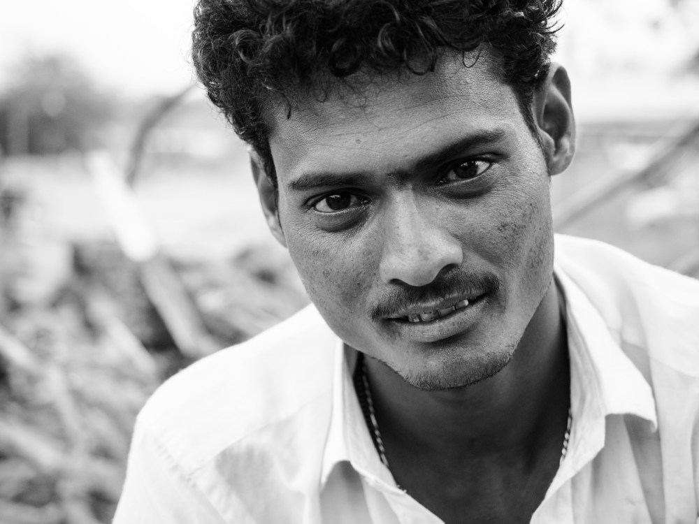
See, I do like B+W!
Color v B+W
This morning I was online looking at some color photos, and they were somewhat disappointing. On the other hand, the B+W seemed pretty good. Why would this be? I believe people who process pictures in B+W are thinking about a final look. To change a photo from color to B+W takes thought, and (admittedly little) skill and time. On the other hand, photographers can capture a color image and post it online without any post-processing. Now, I am aware that we should be spending less time processing and more time capturing images. However, it is through the post-processing stage that we can stamp our mark on the photos we take.
‘Short Cuts’
Before we go into the merits of color grading, let’s take a look at some shortcuts. Both Fujifilm and Olympus both have amazing pre-sets. Fujifilm’s color film presets look just gorgeous, although I am starting to spot them a mile off. Secondly, most cameras have a color profile, i.e., on my Nikon, I can set the color to Natural, Vivid or Black and White (and some other options). If you are not happy with the color of your jpegs, then playing with these in-camera color settings are the first steps to take. A third way to ‘cheat’ is to use a preset in Lightroom or an application such as On 1. Presets save a lot of time and are a quick way to get a very professional look. However, I invariably twiddle with the final settings before I finish with a photograph. Presets are an excellent way for any new photographer to experiment with color.
Colour Grading
If you shoot RAW (and you should), then the color photo produced will be quite flat. Nothing has been done to enhance the photo; it is a canvas ready for manipulation! Below, I have posted the before, and after version of a recent photo I captured.


With the before photo, on the left, the green is far too distracting for my taste. To deal with this I muted and lightened the green in Lightroom. A slight vignette was then added. This helped to blend the green with the contrasting orange next to it. There is a second trick I use that helps lighten skin. Skin tones are often predominantly orange, by increasing the exposure of the orange, you can lighten skin. However, this trick would not work here as the background is also quite orange. What I have also done with this photo is decrease the saturation and vibrance. Just be aware, most people go the opposite way to me with these sliders!
Here are some of my color sliders after I edited this photo.

You can see that I completely desaturated the blue. Blue can often be cast from other sources and can contaminate a photo. If there is no obvious blue in a pic, I will often take it out altogether.
My next step
Last night I was reading Michael Freeman’s, ‘The Photographer’s Eye’, a great book which I highly recommend. Towards the end of the book, there is a section on muted colors. This article demonstrated how the color green could be increased in shadow areas to improve the dramatic impact of a photo. At present, I am unsure how to selectively color grade concerning exposure levels. It is great to have another learning challenge ahead.
Lastly, I am by no means the No’1 expert on color grading. This article is here to inspire some of you to experiment, to try something new and to learn a new skill. There are plenty of ‘how to’ guides out there – go figure!
Take Care and Keep Clicking, Chris
![]()

Have you been to the neighborhood where all of the laundry is done? We haven’t yet, but our friend keeps telling us she wants to take us (or at least Melissa) there. She said the people are really interesting, and I bet you could compose some interesting photos.
LikeLike
I have driven by there and it looks like it could be a great location for photography. Not too far from the centre of town. If you do go let me know, I would love to tag along.
LikeLike
Hi Chris. The link in your blog is broken. Here is the link unbroken so people can subscribe https://youtube.com/channel/UCX8f_HNdZ7zyl9qQK1Z7p7w?view_as=subscriber
Best wishes with your channel
LikeLike
Thanks so much for that photosociology! Fixed
LikeLiked by 1 person
Fab.
LikeLiked by 1 person
Photo Sociolgy…I love the term…it’s what & why we take photos!
LikeLike